


Return on investment serves as the fundamental hallmark of analyzing the strength of a particular real estate investment. However, in order to adjust return to the market (“risk-adjusted return”), investors most often look at overall market fundamentals and trends. It is during this process that I most often get the call – “where should I invest?” Alternatively, the question posed is that of market timing – “is now a good time to get into _______ market?”.
Below I address the topics of both (1) where; and (2) when; and I have chosen to do so n the context of two separate markets that are often points of bifurcation of investment theses, generally strategic or perceived cost to compete.
I chose to compare Snohomish County and South King County (the latter defined by Renton, Kent, Des Moines, Federal Way and SeaTac). At a high level, the analysis produces some interesting conclusions, as well as illuminates some trends useful in investment analysis. If you follow below, I provide data points and graphs supporting my conclusions.
High Level Conclusions
Year-to-Date Sales
- 10 BP difference in average cap rate – 5.7% versus 5.6%
- Difference in average PPSF is approx $17/SF
- Difference in average PPU is approx $10,250
Market Trends
- Both markets have had three distinct shifts since 2000
- Inflection points in market shifts are pronounced, more so in South King County
- In the current cycle, the South End trails Snohomish County by three years, yet is showing strong positive trends
Before we delve too deeply into charts, graphs and statistical data, I am reminded of a quote I hold fondly (popularly attributed to Mark Twain), “There are three kinds of lies: lies, damned lies, and statistics.” Accordingly, each of you may reach different conclusions in viewing the below, yet feel free to give me a call to learn mine.
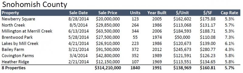
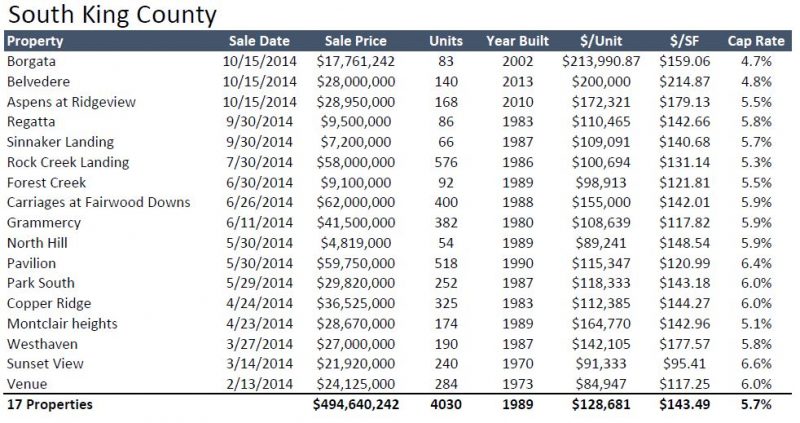
Year-to-Date Sales
Sales data for what encompasses nearly 10 months of 2014 shows that the predominant number of transactions occurred in South King County, 17 versus 8; ~ 75%. South End sales equate to just under $500M of investment capital compared to ~$300M in Snohomish County.
Although one might expect Snohomish County sales to average higher price points (on both a PPSF and PPU basis), the averages are strikingly close to one another. On a cap rate basis, the markets are nearly dead even, yet the South End shows a greater variance (removing the lowest and highest sales) of 160 BP, where the same analysis for Snohomish County shows a variance of only 80 BP.
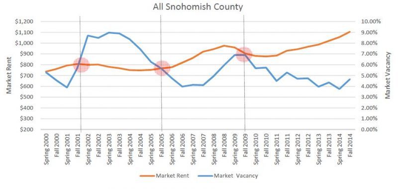
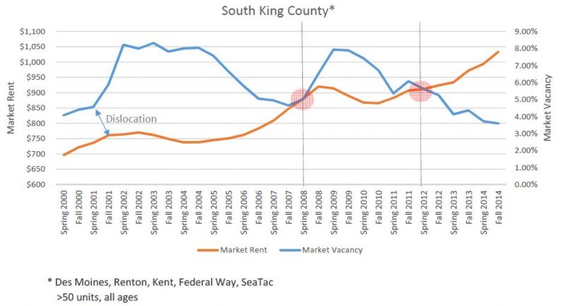
Market Rent & Vacancy
Looking back over the past 14 years to 2000, the below graphs demonstrate three distinct market shifts (setting aside the market dislocation in South King County around 2001). Based on identifying these shifts, one can draw some interesting conclusions on the differences between the dynamics of these markets.
First, South King County routinely trails Snohomish County – by three years in the current cycle. Second, in the past cycles peak-to-trough changes in South King County are more pronounced – yet it is too soon to discern if this phenomenon will repeat in the current cycle. Finally, in absolute rent and vacancy figures, these markets are more similar than they are different.
It is not often that data sets line up this cleanly to tell a story of market similarities and/or differences. In this study we are treated to some interesting conclusions and phenomenon. Please feel free to reach out to me for a deeper discussion on these topics or to explore your own particular investment thesis.